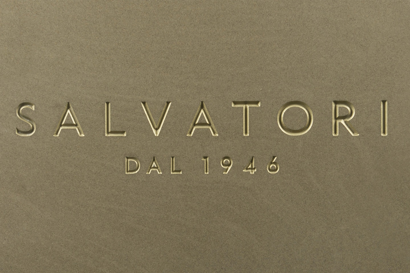
Press release: new logo for Salvatori
03.2022
After 16 years the ubiquitous ‘S’ logo has been retired and the lettering of the name SALVATORI has been reworked
Salvatori, the Italian design company known the world over for its transformation of stone into beautiful and surprising textures, is also not afraid to innovate when it comes to its own brand image.
After 16 years the ubiquitous ‘S’ logo has been retired and the lettering of the name SALVATORI has been reworked. Despite long-held affection for the old logo, it wasn’t, however, a difficult decision to make, according to CEO Gabriele Salvatori.
“Salvatori is a brand that moves with the times, and we have evolved dramatically over the past decade from a company that was known primarily for stone to a name that is linked more and more with high end design” he explains.
“We wanted our logo to reflect our approach which is to create beautiful products which are intrinsically simple and elegant”.
The new-look logo was designed by London-based Kuchar Swara. A self-confessed “font geek”, Kuchar has been responsible for the redesigns of a number of prominent logos including such hallowed magazine titles as The Spectator.
He selected “Edward”, a humanist sans serif font based on the London Underground typeface but with a nod to Art Deco.
“We didn’t want anything too stylised because after all, we’re talking about stone which is classic, it has no frills and unnecessary embellishments. But, at the same time it’s not cold and standoffish.
So we wanted a font that reflected those values and would stand the test of time just as stone does. Plus, I love the way the sharpness of the letters recalls the mountains and quarries of Carrara which is of course part of Salvatori’s story.”
The Edward typeface was also personalised, with the numbers being bespoke drawn for Salvatori in order to highlight the sharp angles of the 4 and 1 and to create the perfect circular forms of the 9 and 6.
The numbers, comprising the year 1946, are an important new element of the logo as it underlines the company’s history with 2016 bringing up 70 years since it was created by Guido Salvatori, the grandfather of today’s owners, Gabriele and Guido.
“We spent months looking at variations of the font, and fine-tuning things. We’re known for our attention to detail with our products, and we’re just as obsessed with perfection when it comes to things such as our logo” explains Gabriele Salvatori.
“From the moment Kuchar showed us the Edward font, we loved it, because it’s so redolent of the golden age of architecture of the early years of the 20th century for example the original signage at many of Italy’s amazing train stations such as Firenze. Plus, it’s bold and elegant and above all simple”.
